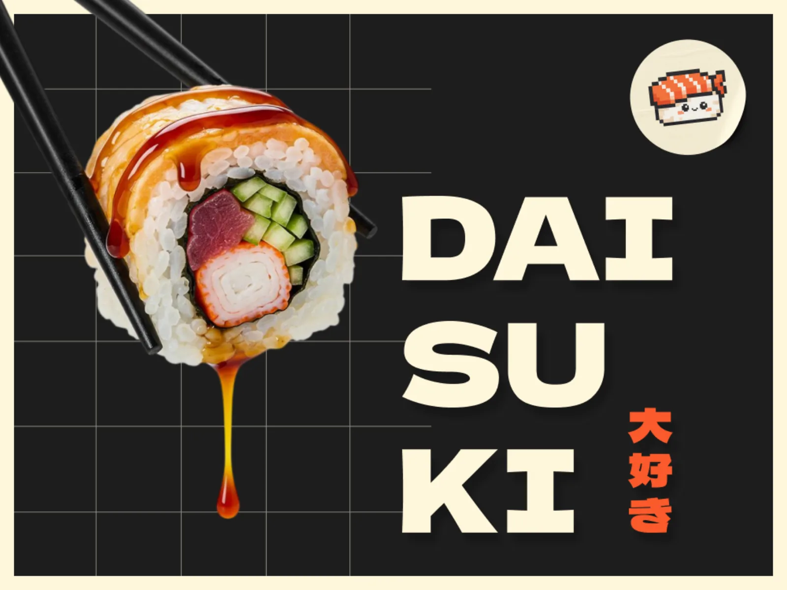
Daisuki
A sushi brand that says “I love it” before you taste it
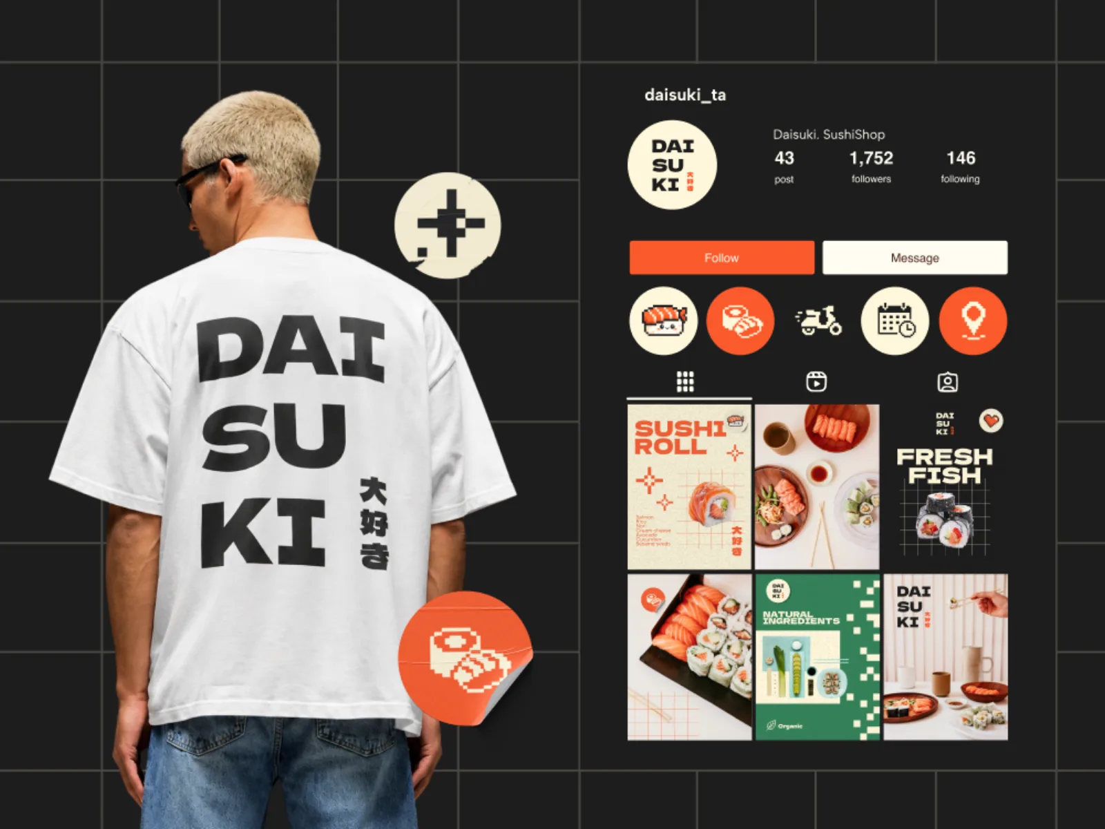
Daisuki means “I love it” in Japanese. We turned that one word into a whole visual language: a stacked DAI·SU·KI logotype, a pixel sushi mascot and a palette lifted straight from the plate.
- Client
- Daisuki Sushi Shop
- Industry
- Food & delivery
- Year
- 2026
- Services
- Brand identity, Logo & mascot, Packaging, Social media design
- Deliverables
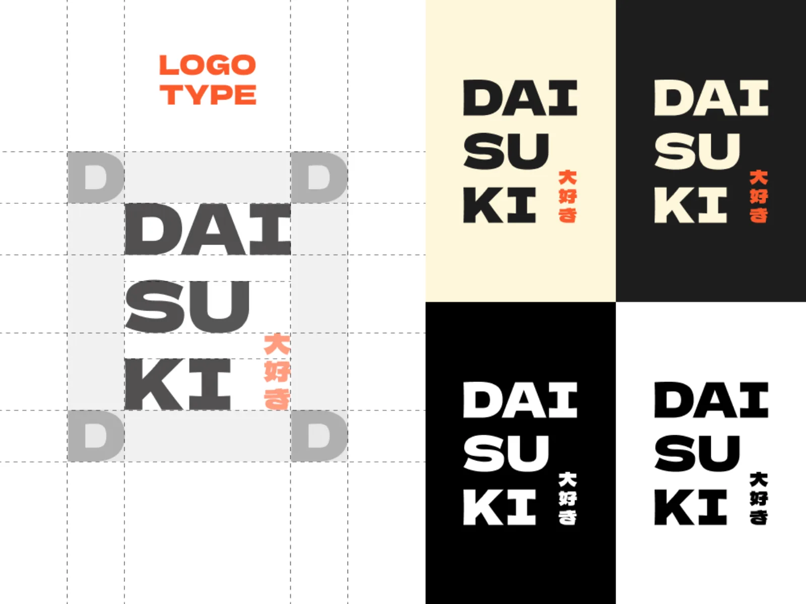
- Logotype & kanji lockup
- Pixel mascot system
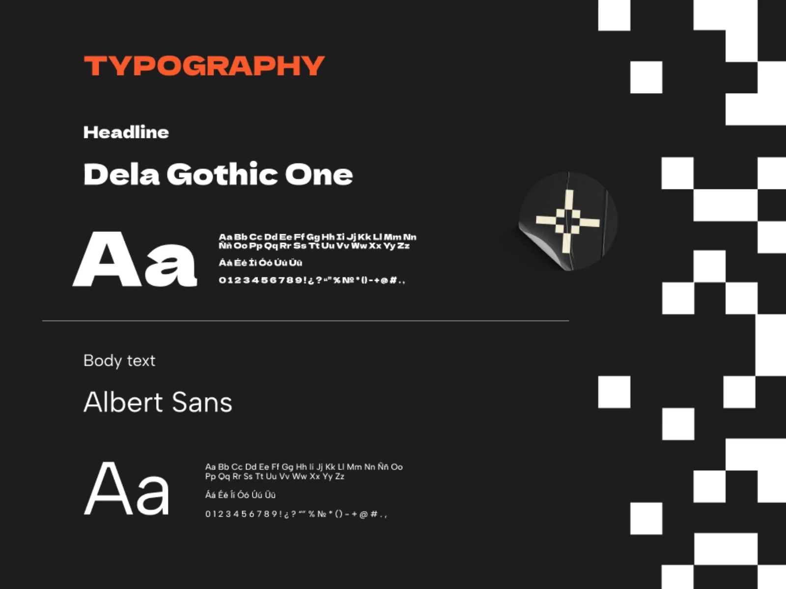
- Colour & type system
- Chopstick sleeves, stickers, tote, tee
- Light-box signage, A-board
- Instagram grid & highlights
Brief
A new sushi shop with delivery as the main channel needed to stand out in a category where every competitor uses the same red circle, the same brush calligraphy and the same stock photo of a roll. The owner wanted a brand young people would wear on a tee, not just order from.
Idea
We looked at what people actually feel when the box arrives: a small, loud joy. That is “daisuki”. So the brand is built on contrast: a heavy, confident logotype next to a cute 8-bit mascot, calligraphy-ink black next to salmon orange and steamed-rice cream. Pixel art gives us a system, not a single picture: every ingredient, sticker and highlight icon comes from the same grid.
Outcome
A full identity shipped in one sprint: logotype with kanji lockup, mascot family, packaging, merch, signage, Instagram grid, plus a short brand book so the team could keep producing content without us. The grid itself became the brand’s signature element, repeated from the chopstick sleeve to the light-box sign.
Logotype
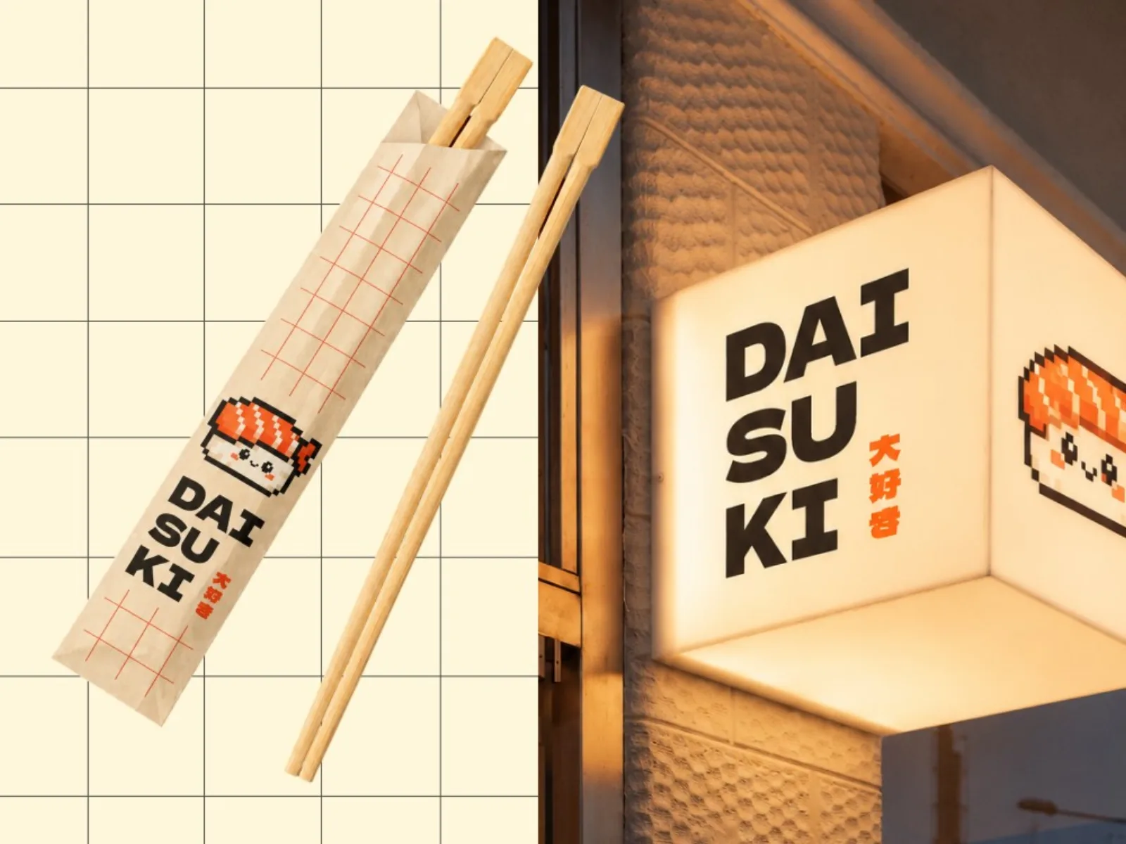
Three syllables, three lines. The stack gives us a square mark that fits a sticker, a tee back and a light box without resizing. The kanji 大好き sits beside it as a small orange signature, the only place where the brand whispers.
Mascot and the grid
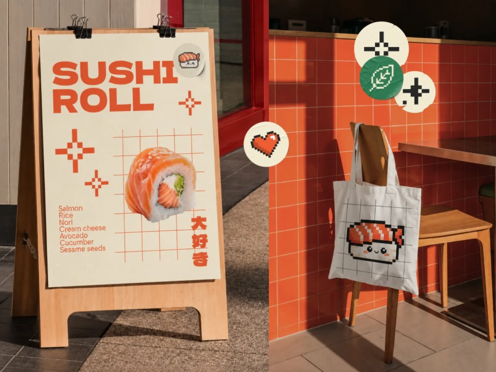
The pixel sushi is drawn on a strict 16-unit grid, so the whole team can extend the family: nigiri, maki, a heart, a leaf for the vegan line, a sparkle for promos. The grid also appears as a thin orange pattern on paper and in posts. It is the thing you recognise from across the street.
Where it lives
Packaging is where delivery brands win or lose. Chopstick sleeves, box stickers and the thank-you card all carry the mascot, so the unboxing is the ad. Outside, the A-board and the light box use the same two colours and nothing else.
Next case
Main & Mini →
Want a brand like this?
Send us a line about the business. We reply within a business day with a first take and a budget range.