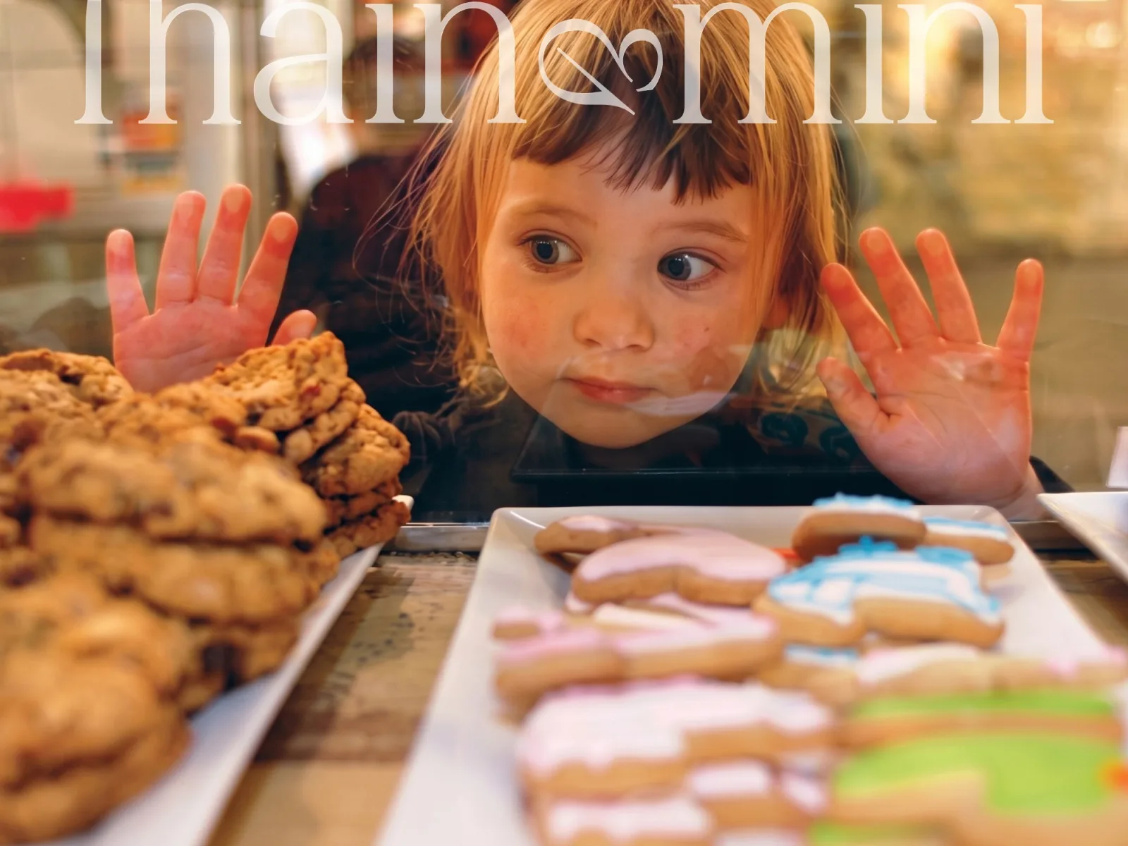
Main & Mini
An elevated indoor play café for parents and their small people
A café where parents get a proper coffee and kids get a proper play space. The identity holds both at once: a quiet serif wordmark for the grown-ups and a small, playful ampersand for the little ones.
- Client
- Main & Mini
- Industry
- Hospitality, family café
- Year
- 2026
- Services
- Naming support, Brand identity, Custom lettering, Social media design
- Deliverables
- Custom wordmark & monogram
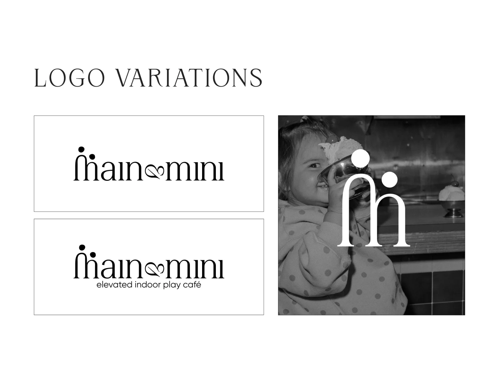
- Logo variations & clear-space rules
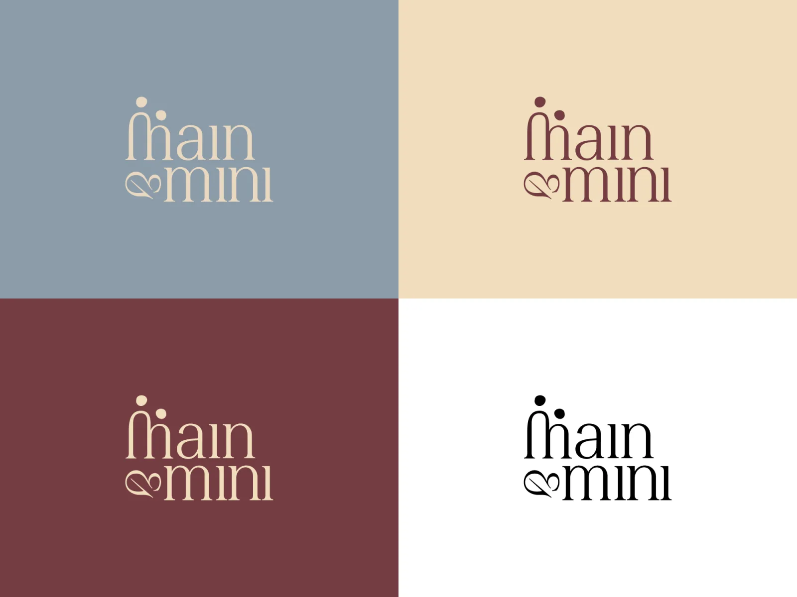
- Colour & type system
- Pattern system
- Takeaway cup, menu, print
- Instagram grid & highlights
Brief
Play cafés usually look like a kindergarten exploded: primary colours, cartoon fonts, balloons. The founders wanted the opposite. A place that feels like a good neighbourhood café, where the kids’ side is designed with the same care as the espresso. The brand had to attract parents first, without pretending children are not there.
Idea
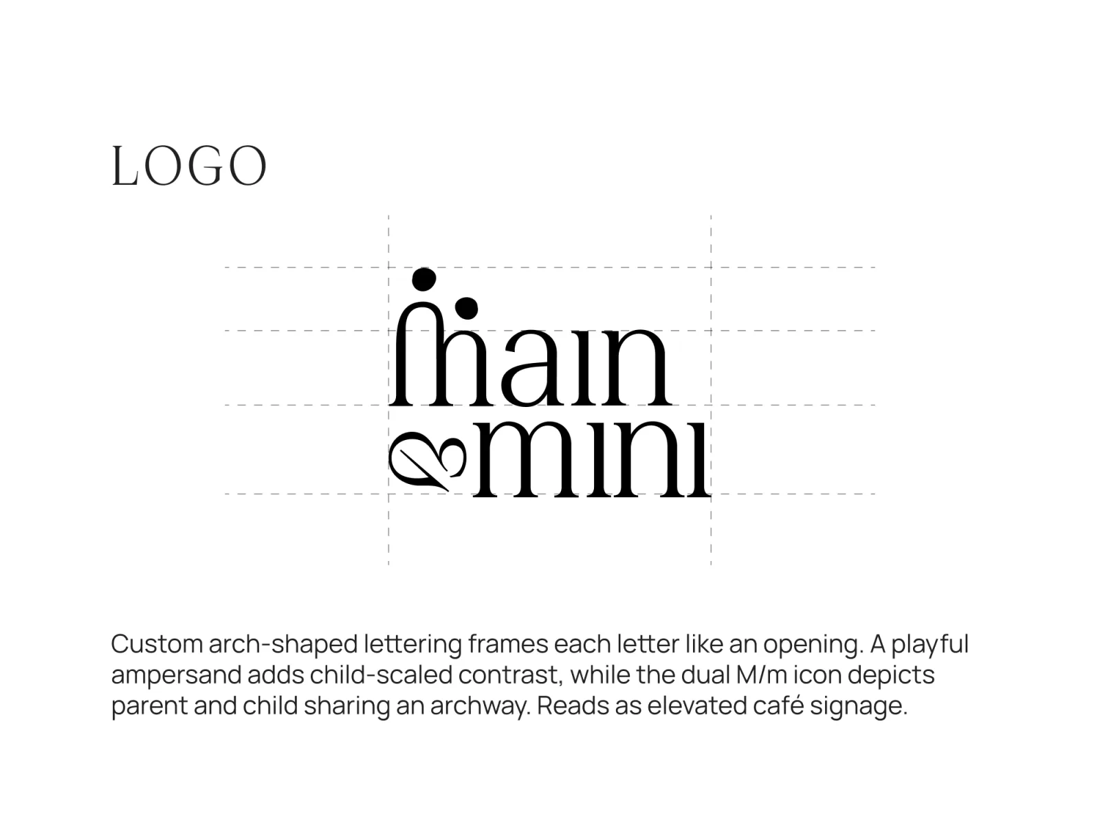
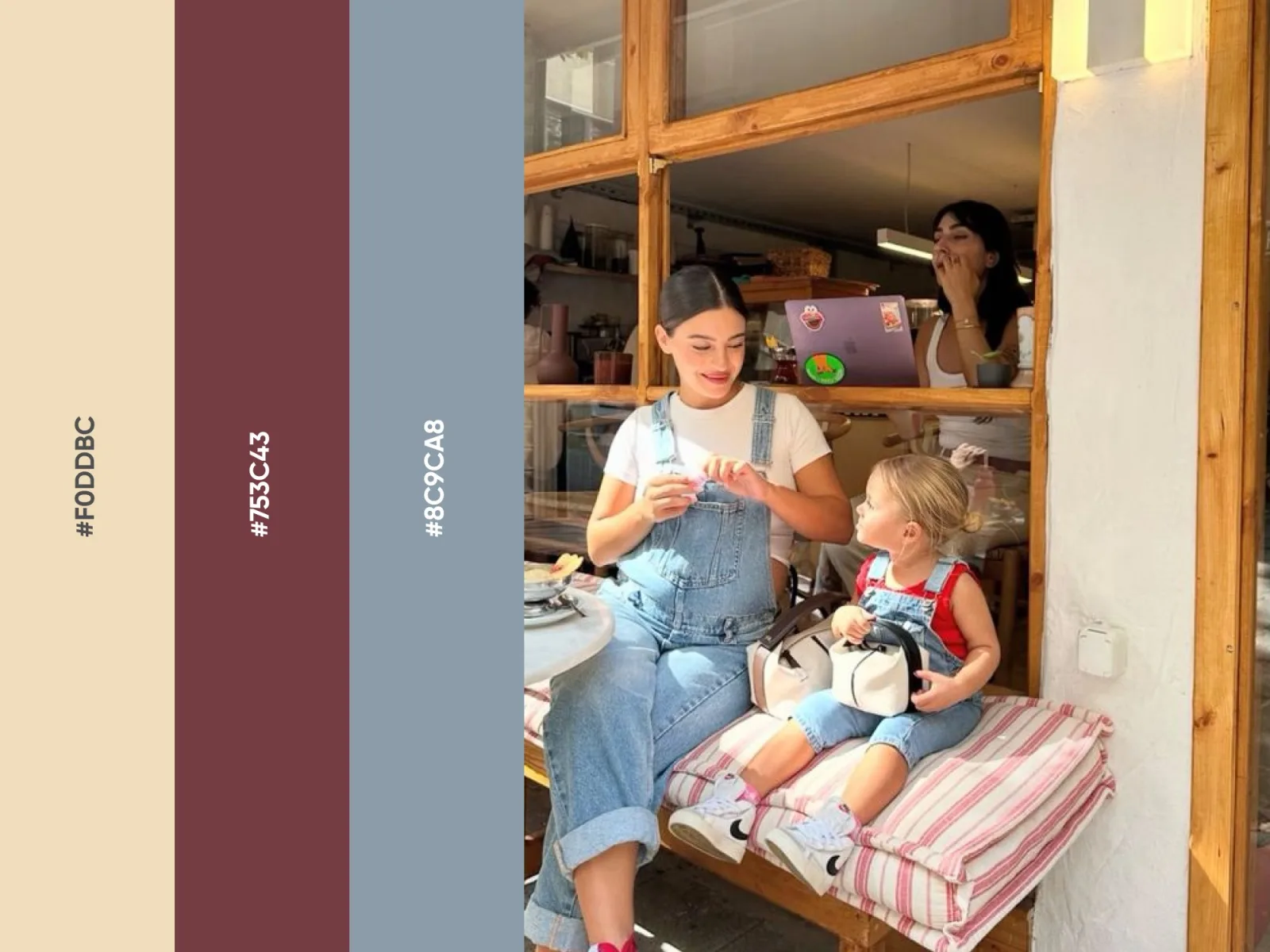
The name already carries the idea: Main and Mini, the big one and the small one. We drew a custom serif where each letter is framed like an archway, an opening you walk through together. The M/m monogram is a parent and child under the same arch. The ampersand is deliberately child-sized and a little mischievous. Everything else stays calm: warm cream, deep berry, dusty blue.
Outcome
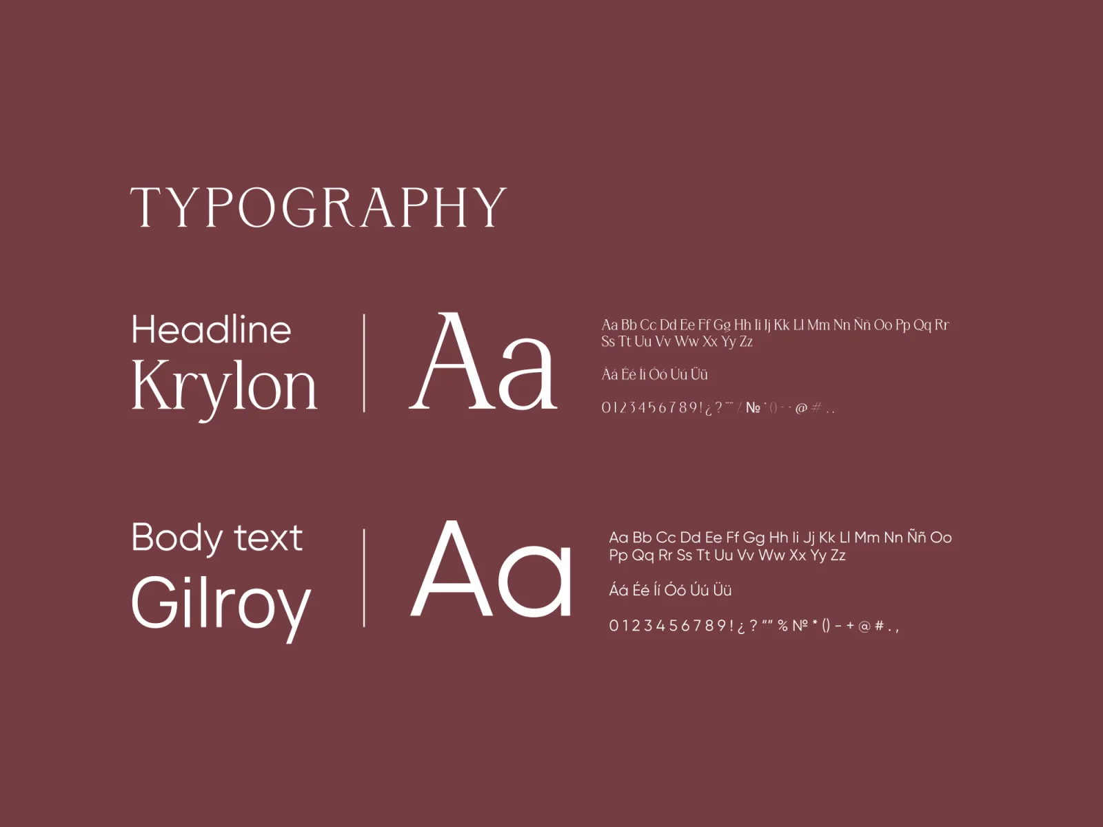
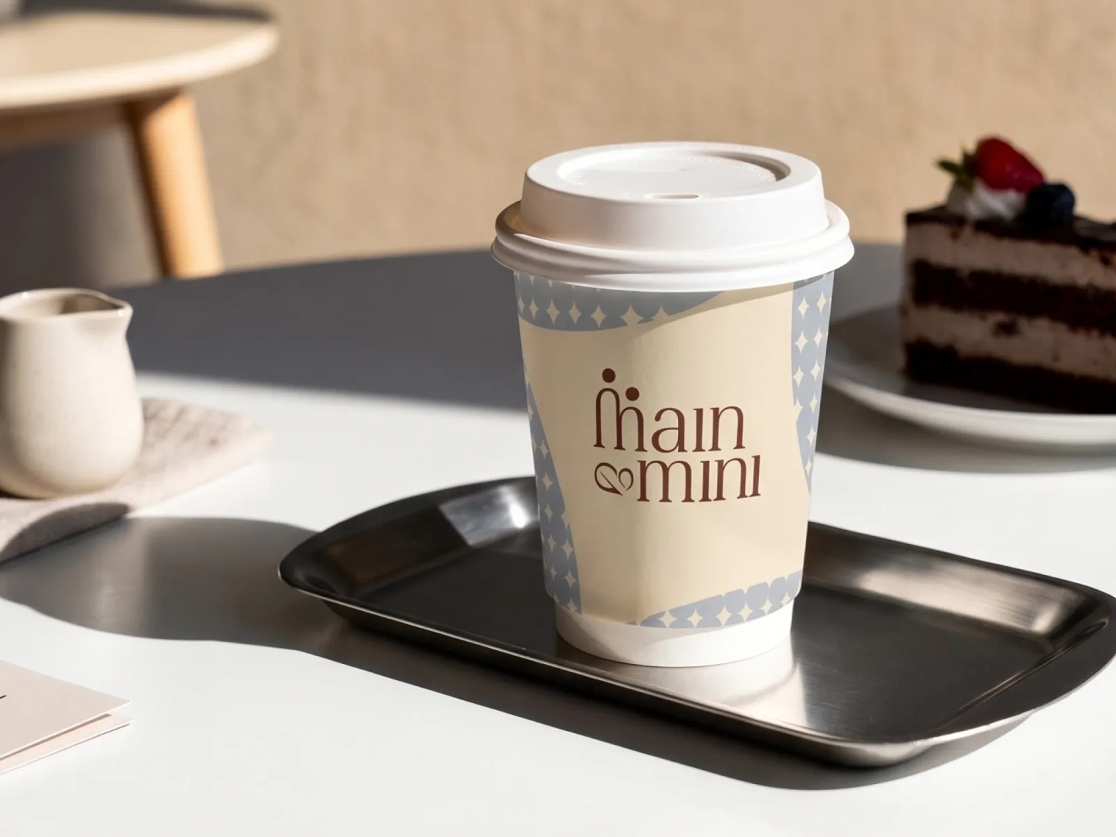
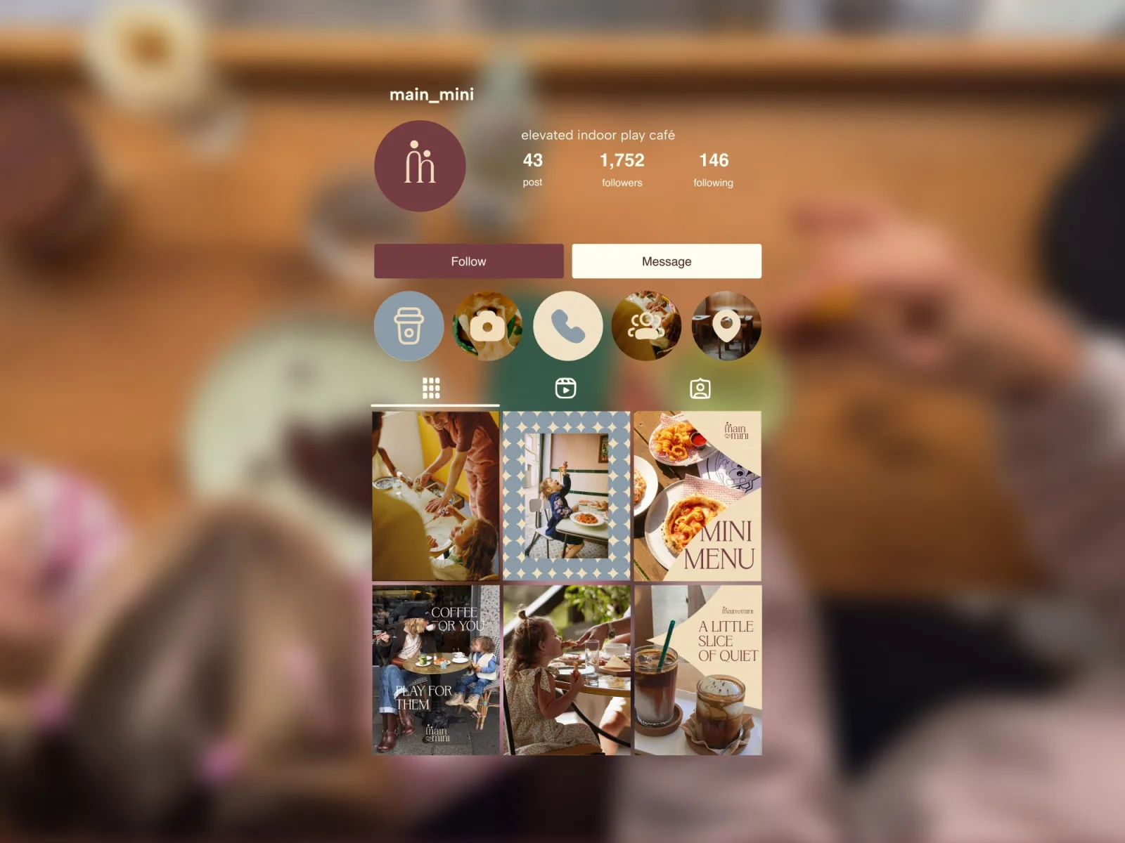
A complete identity and launch content: wordmark, monogram, logo variations with a tagline lockup, palette, type pairing, a soft geometric pattern for packaging, takeaway cups, menu covers and an Instagram system that mixes documentary photography with typographic posts. The result reads as premium hospitality, not a kids’ venue, which is exactly what brings the parents in.
Lettering
The wordmark is drawn, not typed. Arches replace the usual letter bowls, so “main” and “mini” look like a row of doorways. The two dots above the first letters are heads: a parent and a child, the same figures that form the monogram.
Pattern and packaging
A soft diamond-and-circle pattern in blue and cream wraps the cup and frames photos in the feed. It is the “mini” voice of the brand: playful at a distance, calm up close.
Next case
Daisuki →
Want a brand like this?
Send us a line about the business. We reply within a business day with a first take and a budget range.